

Walk down the lighting aisle of any American home improvement store, and you are immediately confronted with rows of LED packaging marked “Soft White” and “Warm White.” Behind these vague commercial labels lies the single most consequential specification in residential interior design: color temperature. The debate between 2700k vs 3000k represents the delicate boundary between a deeply restorative nighttime retreat and a crisp, high-clarity living space. Choosing the incorrect spectrum can leave your master bedroom feeling as stark as an urgent care clinic at midnight, or turn your contemporary living room muddy and dull. Mastering the scientific and architectural differences between these two thresholds ensures your lighting supports both human biology and interior elegance.
Deconstructing the Kelvin Scale in the 2700K vs 3000K Debate
Color temperature is measured using the absolute Kelvin (K) thermodynamic scale. In consumer lighting applications, this metric represents Correlated Color Temperature (CCT), describing the visual warmth or coolness of the white light cast by an LED semiconductor diode. The residential spectrum spans from 2000K (the deep amber flicker of a fireplace) up to 6500K (the icy blue glare of an overcast sky). When evaluating 2700k vs 3000k, homeowners are comparing the two most versatile warm-white options used in modern American homes.
The 2700K Optical Profile: Nostalgic Amber Warmth
A standard 2700K bulb is engineered specifically to match the spectral warmth of traditional tungsten incandescent bulbs developed more than a century ago. Its spectrum is saturated with long red, deep amber, and golden-orange wavelengths. This output creates soft, forgiving shadows and establishes an inviting, relaxing atmosphere throughout intimate residential spaces.
The 3000K Optical Profile: Modern Clean Warmth
A 3000K bulb shifts slightly higher on the thermodynamic scale, removing a substantial portion of the heavy golden-yellow undertones. It projects a clean, creamy white illumination that retains comfortable warmth without dipping into the cold, clinical blue spectrum found in 4000K commercial installations. For open-concept interiors and contemporary finishes, 3000K delivers vibrant surface clarity and visual crispness.
Circadian Science: Comparing 2700K vs 3000K for Nighttime Sleep Quality
Human ocular biology evolved around the natural cycles of solar daylight and incandescent evening firelight. Deep inside the retina sit specialized photoreceptors called intrinsically photosensitive retinal ganglion cells (ipRGCs). These cells do not process visual shapes or images; rather, their melanopsin photopigments measure ambient blue wavelengths to regulate the circadian clock in the suprachiasmatic nucleus of the brain.
Melatonin Synthesis and Blue Peak Emissions in 2700K vs 3000K
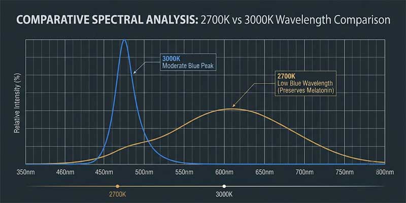
Melanopsin receptors exhibit maximum sensitivity to narrow short-wavelength blue light between 460 and 490 nanometers. When your eyes encounter these frequencies, the brain interprets the signal as midday sunlight, instantly suppressing melatonin production while elevating alertness, heart rate, and cortisol. In the ongoing assessment of 2700k vs 3000k, this spectral difference is paramount:
- 2700K Spectral Characteristics: Premium 2700K diodes significantly reduce short-wave blue spikes, shifting energy toward the safer yellow-red spectrum above 580 nanometers. This warm distribution allows melatonin to build naturally during evening wind-down hours, facilitating deep restorative sleep cycles.
- 3000K Spectral Characteristics: While dramatically milder than 5000K daylight bulbs, 3000K still emits a noticeable amount of blue-cyan light. For individuals prone to sleep-onset insomnia, prolonged nighttime exposure to unshielded 3000K fixtures directly beside the pillow can delay sleep onset.
Minimizing Evening Pupillary Stress and Eye Strain
Reading printed books under high-contrast white lighting forces the pupillary sphincter muscles to contract continuously. When you switch off the bedside lamp and plunge into complete darkness, your eyes must undergo an abrupt optical readjustment that can trigger ocular strain and headaches. The gentle, low-contrast illumination of 2700K softens transitions between light and shadow, easing optic nerves into sleep readiness.
Head-to-Head Comparison Matrix: 2700K vs 3000K Performance
The comparative guide below breaks down the technical and practical differences when selecting between 2700k vs 3000k for your home:
| Evaluation Criteria | 2700K (Soft White / Warm Amber) | 3000K (Crisp Warm White) |
|---|---|---|
| Color Tone Character | Golden-amber, cozy, reminiscent of vintage filaments | Neutral creamy-white, energetic, contemporary clean |
| Circadian Impact | Negligible melatonin suppression; ideal for bedrooms | Moderate suppression; best for early evening use |
| Visual Surface Contrast | Soft and forgiving; conceals architectural blemishes | Sharper edge definition; superior for detail tasks |
| Primary Room Placement | Master bedrooms, guest rooms, reading corners, dens | Living rooms, home offices, closets, grooming vanities |
| Material Compatibility | Walnut, natural oak, warm brass, linen, velvet | Brushed nickel, matte black steel, marble, polished stone |
Why 2700K Remains the Gold Standard for Bedroom Nightstands
When curating lighting for bedside bedroom table lamps flanking your bed, 2700K remains the premier choice recommended by interior designers. Bedside illumination serves a specific functional purpose: to allow comfortable reading and intimate conversation without disturbing circadian biology.
Flattering Diffusion Through Woven Lampshades
High-end bedside fixtures typically feature shades crafted from off-white linen, raw parchment, or natural cotton. When 2700K light filters through these organic fibers, the weave acts as an optical warm filter, diffusing remaining trace blues and casting a soothing amber pool over your nightstand and mattress. Conversely, comparing 2700k vs 3000k through textured beige shades reveals that 3000K can sometimes cause an unappealing greenish tint due to uneven spectral dispersion across synthetic linings.
Replicating the Ancestral Sunset Effect
Throughout human history, the descending sun signaled the physical body to prepare for rest as sunlight shifted downward into the low-Kelvin amber spectrum. Positioning warm 2700K table fixtures below eye level perfectly mimics this natural dusk environment. This low-angle warm light promotes relaxation and lowers blood pressure far more effectively than harsh overhead lighting.

When 3000K Delivers Superior Results in Living Spaces
Despite the biological advantages of 2700K in the bedroom, using 2700K across an entire modern home can feel dated. Modern open-concept floor plans and multi-functional zones thrive under the clean, vibrant balance of 3000K.
1. Multi-Functional Living Rooms
Living rooms host diverse daily activities, from entertaining guests and helping children with homework to reading and watching films. While 2700K can feel overly sleepy during social gatherings, 3000K provides an invigorating ambiance that keeps architectural details crisp. Reviewing versatile designs within our curated table lamp collection highlights how contemporary ceramic and metal fixtures excel when paired with 3000K illumination.
2. Walk-In Closets and Grooming Mirrors
Selecting daily attire under 2700K can lead to annoying wardrobe mistakes. The heavy amber hue can cause midnight navy to appear black, turn crisp white shirts creamy yellow, and obscure subtle fabric patterns. Installing 3000K fixtures with high Color Rendering Index ratings ensures accurate color perception and true skin tone representation.
Homes featuring minimalist interiors—such as gallery-white walls, polished concrete, and dark steel accents—can look visually mismatched under heavy golden lighting. In these contemporary spaces, evaluating 2700k vs 3000k proves that 3000K preserves crisp architectural lines and keeps pure white finishes looking fresh without feeling cold.
How Paint Colors and Room Finishes Interact with Light
Wall paint pigments do not generate their own color; they absorb specific wavelengths and reflect others. The color temperature you select determines which undertones become prominent inside your room.
Warm Off-Whites and Earth Tones
Paints featuring subtle beige, cream, or taupe undertones look rich and welcoming under 2700K lighting. The golden spectrum enriches the warmth of the room, creating an inviting, cozy feel. Under 3000K, these same paints read as clean neutral whites, reducing golden notes while preserving warmth.
Cool Whites and Dark Accent Walls
Paints designed with cool gray or blue undertones can appear dingy or yellowish under 2700K light. These modern shades require 3000K to maintain their crisp, clean look. Similarly, dark accent walls in navy, charcoal, or forest green absorb considerable light volume. Using 3000K helps reflect light off dark surfaces, preventing the room from feeling dim or cave-like.
Lumens vs. Kelvin: Balancing Brightness with Color Warmth
A frequent mistake in residential lighting is confusing color temperature with lumen output. Homeowners often purchase a 3000K bulb assuming it is inherently “brighter,” or choose 2700K assuming it will automatically be “dim.”
Color temperature (Kelvin) measures the color tone of the light; luminous flux (Lumens) measures the total quantity of light emitted. A 2700K bulb producing 800 lumens emits the exact same amount of light as a 3000K bulb producing 800 lumens. When choosing 2700k vs 3000k for bedtime nightstands, aim for 400 to 450 lumens (equivalent to a 40W vintage incandescent bulb). In living rooms and reading areas, choose 650 to 800 lumens to ensure effortless visibility without eye strain.

Essential Lighting Specifications: CRI and Dimming Controls
When selecting bulbs for your home, look closely at two critical engineering metrics: Color Rendering Index (CRI) and dimming compatibility.
Always choose LED bulbs featuring a CRI rating of 90 or higher (CRI 90+). High CRI ratings ensure that natural wood furniture, linen fabrics, and artwork display vibrant, authentic colors. Inexpensive bulbs with low CRI ratings often cast artificial greenish tints that make rooms look unappealing.
Additionally, always ensure your fixtures support smooth dimming controls. Dimming a 2700K bedside fixture down to 10% or 20% brightness in the late evening delivers the tranquil glow of a flickering candle, allowing your body to transition effortlessly into restorative sleep.
Strategic Layering: Using 2700K and 3000K in the Same Home
You do not need to choose exclusively between 2700k vs 3000k for your entire house. The most effective lighting designs use deliberate vertical layering across different fixtures.
A proven design approach is vertical temperature separation: install 3000K bulbs in recessed ceiling downlights to deliver bright, functional illumination for cleaning and morning routines. Then, equip eye-level table lamps and accent fixtures with warm 2700K bulbs. As bedtime approaches, turn off the ceiling grid completely and rely solely on the warm pools of 2700K light from your side lamps to cue your body for sleep.
Frequently Asked Questions About 2700K vs 3000K
Is 2700K or 3000K better for reading printed books?
For reading in a dedicated study or living room during daytime and early evening hours, 3000K offers superior contrast between dark print and paper. However, for reading in bed during the final hour before sleep, 2700K is strongly recommended to avoid disrupting natural melatonin production.
Can I use both 2700K and 3000K bulbs in the same bedroom?
Yes, provided they are placed in separate functional zones. You can use 3000K fixtures inside a walk-in wardrobe or over a vanity mirror, while keeping 2700K bulbs in your bedside table lamps. Avoid placing 2700K on one nightstand and 3000K on the other side of the same bed, as the visible color mismatch looks uncoordinated.
Does a 2700K LED bulb look too yellow on modern furniture?
High-quality 2700K LED bulbs with CRI 90+ produce an elegant golden-amber glow rather than a harsh yellow cast. Cheap, low-CRI bulbs often suffer from uneven color output that creates unappealing tints, so always invest in quality bulbs with reliable color rendering.
